Business Problem
There are documented inconsistencies of Global Utility Navigation...

...and also the Account Menu across in-app experience

During summer 2021, I worked as a UX design intern in the Design Foundation Team, which collaborates with designers across the company to ensure the diversity of thinking and to gain understanding about the deeper needs of individual product teams and business units at GoDaddy. My Team focused on implementing the North Star created in 2020, which is a vision of GoDaddy's design and product strategy in next 3 to 5 years.
My intern project specifically focuses on designing and delivering the Global Utility Navigation strategy and Account Menu Experience, aligning with the North Star Vision.
Proposed design recommendation of interactive states and dark/light mode version of Global Utility Navigation that provides access to all system level utilities/tasks for customers and Account Menu Experience that allows customers to perform account level actions.
Worked cross functionally to connect with PMs, stakeholders to understand individual business requirement and with engineers to learn the implementation constrains.
Implemented both Global Utility Nav and Account Menu component with the engineering team.
Conducted 5 unmoderated A/B testings with 20 GoDaddy users for each test to compare the current Account Menu Experience and the proposed design recommendations.
Crafted high quality presentations for the implementation strategies and design language documentations.
Presented design iterations, documentations, and proposals to the senior design leadership.
Incremental conversion rate when browsing from the navigation was increased by 13.8%.
GoDaddy web product browsing accuracy was increased from 46% to 79%.
Although we have made great progress on building and refining navigation systems at GoDaddy, inconsistent navigation patterns still exist and do not align with customers' expectations. Switching across different pages, managing tasks workspace for business owners are challenging. Therefore, we planned to redesign the navigation patterns, especially Global Utility navigation, in conjunction with Account Menu to make sure customers could have more consistent experience managing their tasks and business as well as being able to switch between different workspaces.
Resolve the inconsistency of Global Utility Navigation.
Make design recommendations on Account Menu nested on Global Utility Navigation on the top right corner.
You are living in a large house that contains a many utilities, such as lights, water, heat, security camera and more. As you are getting ready to get rest, you just realized that we need to turn off the lights in another room, or managing the security camera at the front door...
Instead of getting up and going to individual rooms to manage specific devices, what if there is a master utility application that allows you to control utility anywhere within the room? We even want to control area-specific utility depending on where we are in the house. For example, if you are the in kitchen, it is more convenient for you to have a switch allowing you to only manage the kitchen appliance.
This is principle similar to GoDaddy Customers, they need to be able to control system-level utilities while making account level decisions anywhere within the product,
There is not a consistent global navigation patterns for across GoDaddy's products, on the top right corner of the website and the application.
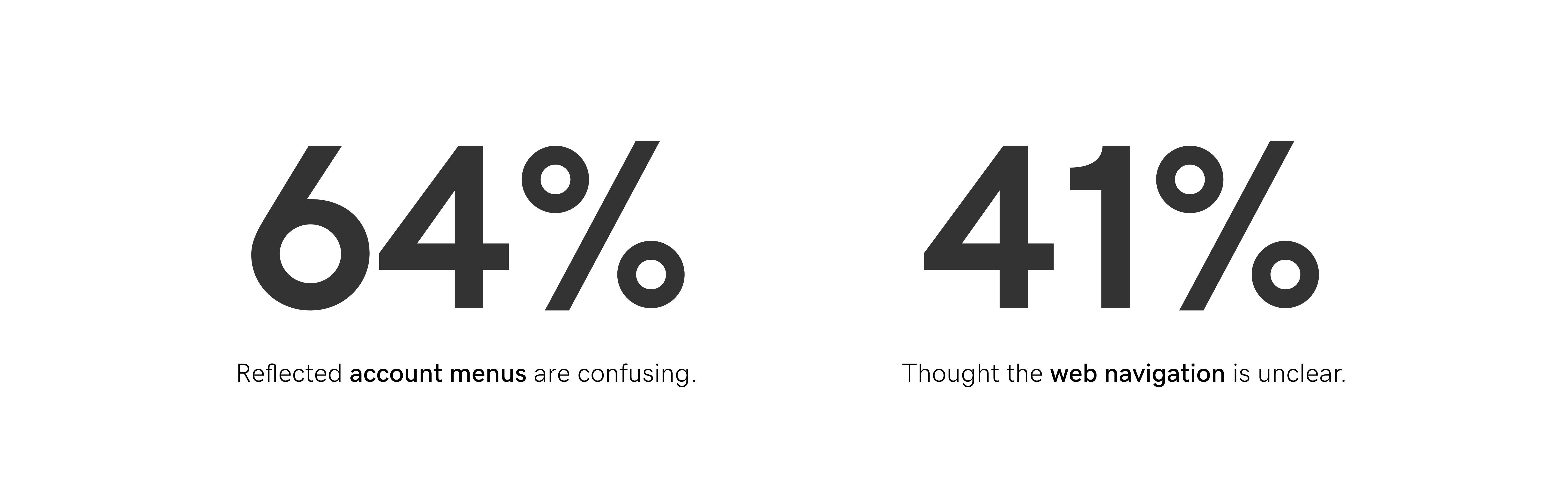
In addition, from the previous testing data and live user feedback on GoDaddy’s website, 64% of the customers who left feedback mentioned the account menus are confusing, taking a longer time for new customers to identify its functionality, and about 41% of the customers thought the navigation is unclear and needs to be improved.
Those high percentage told us that customers feel confused and dissatisfied about the global navigation experience of the product. This will further result in losing customers who will look into other GoDaddy’s competitors. That is why consistent placement and intentional minimalism need to be emphasized.
As the name suggests, the Global Utility Nav provides access all system level utilities and tasks. It also groups and contains all global-level actions and tools, shared across all experiences including GoDaddy home page and Help Center.
Account menu display the important information for users to make account level decisions. The key objectives of the Account Menu include:
Displaying precise information for customers to perform system action regarding their account
Working in conjunction with the Global Utility Navigation

After communicating with business stakeholders (PM for the Account Menu, Designers of Pro/Partners' Experience) and iterating designs with peer designers from my team. I proposed the the following design solution for Global Utility Nav and Account Menu.
When considering why I propose these specific design version, I need to make sure that the designs that I proposed strictly follow GoDaddy's design system to ensure a consistent web experience. Visual consistency is the key when designing for corporate products.
There has been a need to extend this navigation to support Business unit specific tasks and actions that are global in nature. The red boxed components varies depending on the specific GoDaddy's web product. Below is an example for the web in-app pro experience navigation, the icon allows users to separate by the slash allows users to refresh their page, which is a specific feature that only exists in this part of the Pro experience.

Here is a brief overview of the different states of the global utility icon, we have normal, hover, and active, as well as the corresponding dark mode version available for Pro/Partners' Experience.
Active state is when a user clicks the icon.

The goal is to take a step towards the North Star visual style while minimizing the information display on the panel, which is shown as the progressive disclosure that hides the secondary level information, highlighted in pink.
Both Near and North Star version of the account menu are the first level but different variations. When clicking "Control Panel Links," the Account Menu panel shrinks to the sub-menu, shown as the third figure.

I communicated with business stakeholders' needs with variations that aligned with their product section, such as VIP account, Pro Account, and Pro Account with VIP.
Here are cases for users who haven't upload their profile photo yet.

Specifically for Pro/Partner's Experience, customers are allowed to upload their own photo as their profile picture.
Here are cases for users who uploaded their profile photos.

Edge cases are also considered while designing the authenticated version of the account menu, required by the engineering team. For example, The first case shows that the customer does not enter the username and their full name; the second case shows the user only enters their user name without entering the full during the registration process.

Inconsistent utility navigation across GoDaddy's web products (as highlighted).

We made our navigation experience consistent (global) across web products.

Inconsistent account menu across GoDaddy's products

We make account menu design consistent, with different variations for a specific GoDaddy's product, such as VIP pro/partners account menu (2nd figure below) is different than the account menu shown at the front site (1st figure below). However, the overall styling of the account menu should be consistent across all products.

At the end of the internship, I worked with my manager to propose a testing plan and unblocked the A/B test in September 2022.
4 tests: 2 for Independent/DRI product; 2 for Pros/Partners Experience product
1 test on Control Panel Links
Test the effectiveness of the North Star Account Menu
Identify potential unseen usability issues of the current Account Menu
Identify the usefulness of the Control Panel Links

The internship was definitely the most memorable career enrichment experience for me before entering into the industry as a student. I learned a lot during such a short period time.
Understanding peers in the team:
It was beneficial to get to know everyone in a team via 1:1 meetings during the onboarding week to understand their workflow and expectations! being in a team consisting designers with more than 10 years of experience can be intimidating. Getting to know people in the team can help to increase the efficiency of communications and collaborations.
Learning to navigate through conflicting feedback:
Although understanding everyone's perspectives is essential to move forward but can be conflicting sometimes, I learned to make more informed decision about my design with stronger rationales.
Receiving & giving feedback:
Sharing design and asking questions when getting stuck is not a sign of showing weakness. Instead, knowing where my stand is is a faster way of learning and growing.
Storytelling & public speaking:
From the soft skill standpoint, I learned to speak about my work as a process rather than a series of activities to show my design thinking. Working cross functionally, I also learned to break down the complex problems into relatable analogies while bringing alignment across my audiences.